```json
//[doc-seo]
{
"Description": "Discover ABP's UI Theming system for Blazor, enabling customizable, theme-independent applications with reusable modules and easy upgrades."
}
```
# Blazor UI: Theming
````json
//[doc-params]
{
"UI": ["Blazor", "BlazorServer"],
"BlazorUI": ["Blazorise", "MudBlazor"]
}
````
## Introduction
ABP provides a complete **UI Theming** system with the following goals:
* Reusable [application modules](../../../modules) are developed **theme-independent**, so they can work with any UI theme.
* UI theme is **decided by the final application**.
* The theme is distributed via a NuGet package, so it is **easily upgradable**.
* The final application can **customize** the selected theme.
In order to accomplish these goals, ABP;
* Determines a set of **base libraries** used and adapted by all the themes. So, module and application developers can depend on and use these libraries without depending on a particular theme.
* Provides a system that consists of layout parts (like [navigation menus](navigation-menu.md) and [toolbars](toolbars.md)) that is implemented by all the themes. So, the modules and the application to contribute to the layout to compose a consistent application UI.
### Current Themes
Currently, three themes are **officially provided**:
* The [Basic Theme](basic-theme.md) is the minimalist theme with the plain Bootstrap style. It is **open source and free**.
* The [Lepton Theme](https://abp.io/themes) is a **commercial** theme developed by the core ABP team and is a part of the [ABP](https://abp.io/) license.
* The [LeptonX Theme](https://x.leptontheme.com/) is a theme that has a [commercial](../../../ui-themes/lepton-x/blazor.md) and a [lite](../../../ui-themes/lepton-x-lite/blazor.md) version.
## Overall
### The Base Libraries
{{if UI == "Blazor"}}
All the themes must depend on the [Volo.Abp.AspNetCore.Components.WebAssembly.Theming](https://www.nuget.org/packages/Volo.Abp.AspNetCore.Components.WebAssembly.Theming) NuGet package, so they are indirectly depending on the following libraries:
{{end}}
{{if UI == "BlazorServer"}}
All the themes must depend on the [Volo.Abp.AspNetCore.Components.Server.Theming](https://www.nuget.org/packages/Volo.Abp.AspNetCore.Components.Server.Theming) NuGet package, so they are indirectly depending on the following libraries:
{{end}}
{{if BlazorUI == "Blazorise"}}
* [Twitter Bootstrap](https://getbootstrap.com/) as the fundamental HTML/CSS framework.
* [Blazorise](https://github.com/stsrki/Blazorise) as a component library that supports the Bootstrap and adds extra components like Data Grid and Tree.
* [FontAwesome](https://fontawesome.com/) as the fundamental CSS font library.
* [Flag Icon](https://github.com/lipis/flag-icons) as a library to show flags of countries.
These libraries are selected as the base libraries and available to the applications and modules.
> Bootstrap's JavaScript part is not used since the Blazorise library already provides the necessary functionalities to the Bootstrap components in a native way.
{{end}}
{{if BlazorUI == "MudBlazor"}}
* [MudBlazor](https://mudblazor.com/) as the component library, providing a Material Design component set built natively for Blazor (form controls, data grid, dialogs, snackbars, dates, etc.).
* [FontAwesome](https://fontawesome.com/) as the fundamental CSS font library.
* [Flag Icon](https://github.com/lipis/flag-icons) as a library to show flags of countries.
These libraries are selected as the base libraries and available to the applications and modules.
A theme using the MudBlazor variant must place the four MudBlazor providers in the layout root so dialogs, snackbars and popovers work everywhere:
```razor
@Body
```
The provided themes (`Volo.Abp.AspNetCore.Components.Server.MudBlazorLeptonXTheme`, `Volo.Abp.AspNetCore.Components.WebAssembly.MudBlazorLeptonXTheme`, etc.) ship these providers as part of their layout templates.
{{end}}
### The Layout
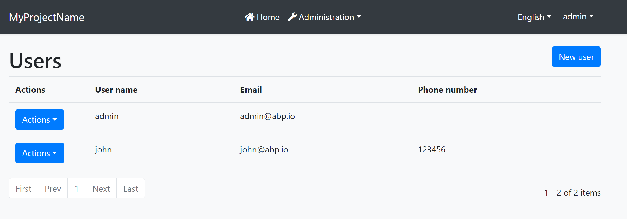
All themes must define a layout for the application. The following image shows the user management page in the [Basic Theme](basic-theme.md) application layout:
And the same page is shown below with the [Lepton Theme](https://abp.io/themes) application layout:
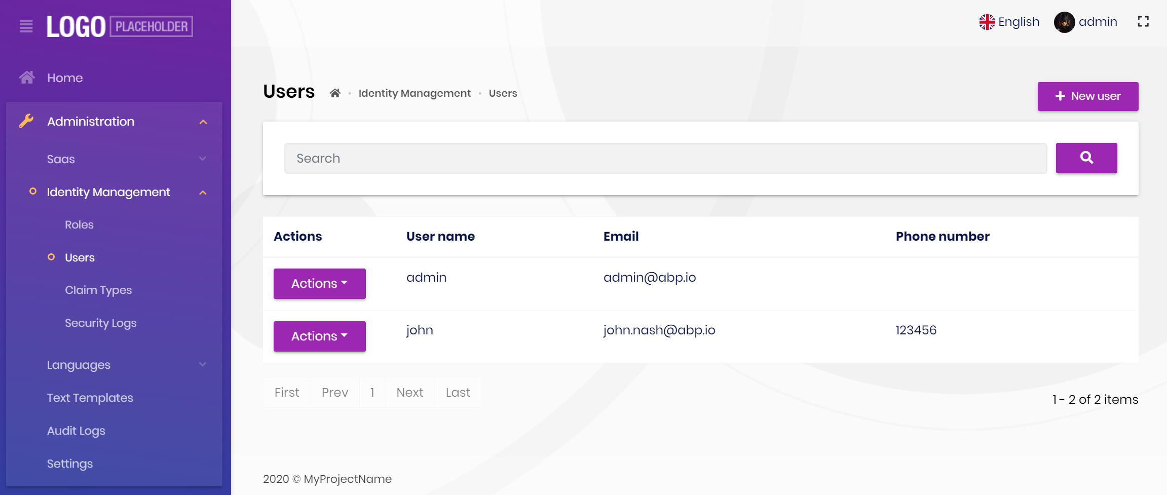
As you can see, the page is the same, but the look is completely different in the themes above.
The application layout typically includes the following parts;
* A [main menu](navigation-menu.md)
* Main [Toolbar](toolbars.md) with the following components;
* User menu
* Language switch dropdown
* [Page alerts](page-alerts.md)
* The page content (aka `@Body`)
## Implementing a Theme
A theme is simply a Razor Class Library.
### The Easiest Way
The easiest way of creating a new theme is adding [Basic Theme Source Code](https://github.com/abpframework/abp/tree/dev/modules/basic-theme) module with source codes and customizing it.
{{if BlazorUI == "Blazorise"}}
{{if UI == "Blazor"}}
```bash
abp add-package Volo.Abp.AspNetCore.Components.WebAssembly.BasicTheme --with-source-code --add-to-solution-file
```
{{end}}
{{if UI == "BlazorServer"}}
```bash
abp add-package Volo.Abp.AspNetCore.Components.Server.BasicTheme --with-source-code --add-to-solution-file
```
{{end}}
{{end}}
{{if BlazorUI == "MudBlazor"}}
{{if UI == "Blazor"}}
```bash
abp add-package Volo.Abp.AspNetCore.Components.WebAssembly.MudBlazorBasicTheme --with-source-code --add-to-solution-file
```
{{end}}
{{if UI == "BlazorServer"}}
```bash
abp add-package Volo.Abp.AspNetCore.Components.Server.MudBlazorBasicTheme --with-source-code --add-to-solution-file
```
{{end}}
{{end}}
### Global Styles / Scripts
A theme generally needs to add a global style to the page. ABP provides a system to manage the [Global Styles and Scripts](global-scripts-styles.md). A theme can implement the `IBundleContributor` to add global style or script files to the page.
**Example: Adding a style to the page**
````csharp
using Volo.Abp.Bundling;
namespace MyTheme
{
public class MyThemeBundleContributor : BundleContributor
{
public override void ConfigureBundle(BundleConfigurationContext context)
{
context.Files.AddIfNotContains("_content/MyTheme/styles.css");
}
}
}
````
```cs
[DependsOn(
typeof(AbpAspNetCoreComponentsWebAssemblyThemingBundlingModule)
)]
public class MyBlazorWebAssemblyBundlingModule : AbpModule
{
public override void ConfigureServices(ServiceConfigurationContext context)
{
Configure(options =>
{
// Add style bundle
options.StyleBundles.Get(BlazorWebAssemblyStandardBundles.Styles.Global)
.AddContributors(typeof(MyThemeBundleContributor));
});
}
}
```
`styles.css` file should be added into the `wwwroot` folder of the theme project for this example.
See the [Global Styles and Scripts](global-scripts-styles.md) document for more.
### Layout Parts
A typical Layout consists of several parts. The theme should include the necessary parts in each layout.
**Example: The Basic Theme has the following parts for the Application Layout**
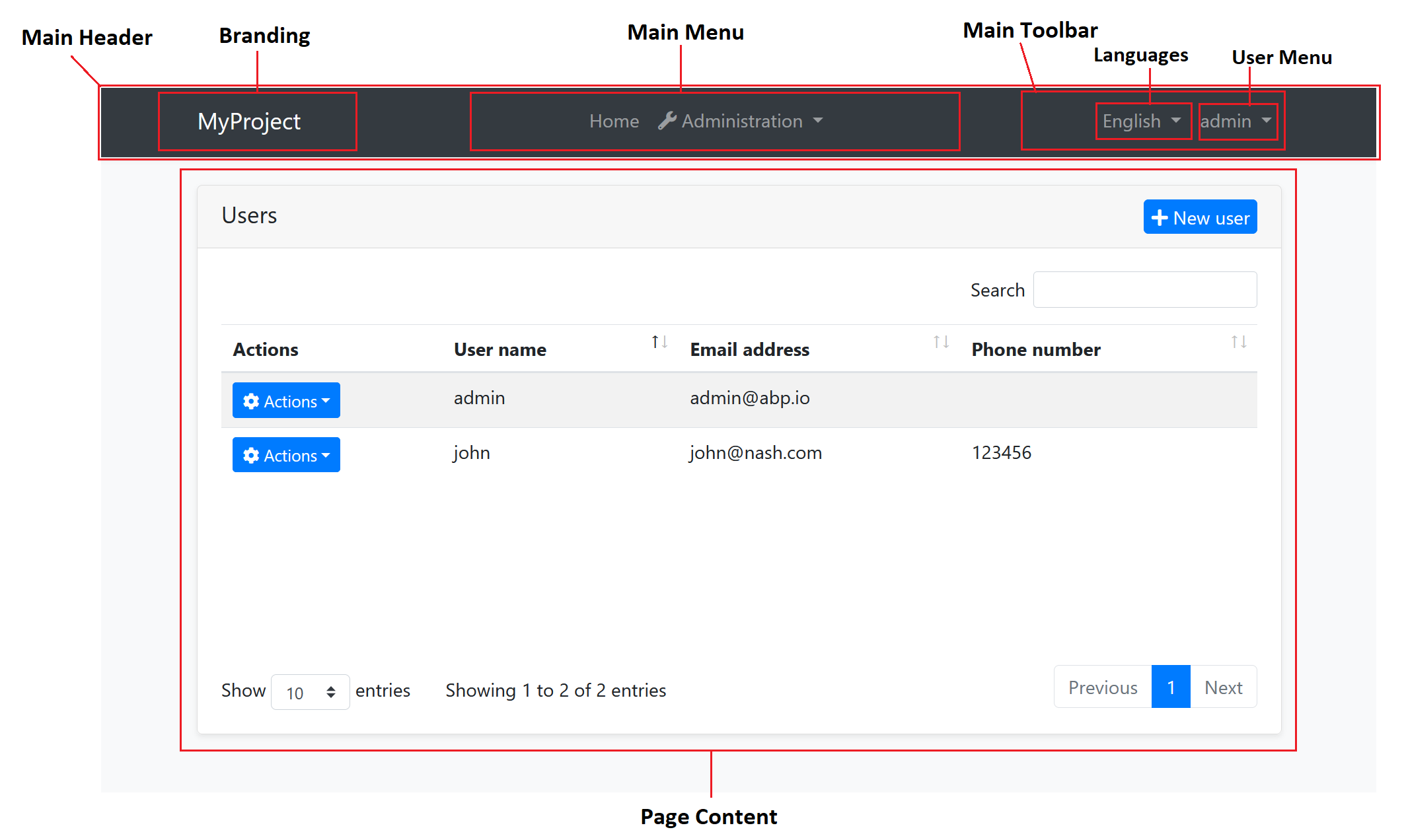
The application code and the modules can only show contents in the Page Content part. If they need to change the other parts (to add a menu item, to add a toolbar item, to change the application name in the branding area...) they should use the ABP APIs.
The following sections explain the fundamental parts pre-defined by the ABP and can be implemented by the themes.
> It is a good practice to split the layout into components/partials, so the final application can override them partially for customization purpose.
#### Branding
`IBrandingProvider` service should be used to get the name and the logo URL of the application to render in the Branding part.
The [Application Startup Template](../../../solution-templates/layered-web-application) has an implementation of this interface to set the values by the application developer.
#### Main Menu
`IMenuManager` service is used to get the main menu items and render on the layout.
**Example: Get the Main Menu to render in a razor component**
```csharp
// Code behind file of a razor component
public partial class NavMenu
{
private readonly IMenuManager _menuManager;
public NavMenu(IMenuManager menuManager)
{
_menuManager = menuManager;
}
protected override async Task OnInitializedAsync()
{
var menu = await _menuManager.GetAsync(StandardMenus.Main);
//...
}
}
```
See the [Navigation / Menus](navigation-menu.md) document to learn more about the navigation system.
#### Main Toolbar
`IToolbarManager` service is used to get the Main Toolbar items and render on the layout. Each item of this toolbar is a Razor Component, so it may include any type of UI elements. Inject the `IToolbarManager` and use the `GetAsync` to get the toolbar items:
````csharp
var toolbar = await _toolbarManager.GetAsync(StandardToolbars.Main);
````
> See the [Toolbars](toolbars.md) document to learn more on the toolbar system.
The theme has a responsibility to add two pre-defined items to the main toolbar: Language Selection and User Menu. To do that, create a class implementing the `IToolbarContributor` interface and add it to the `AbpToolbarOptions` as shown below:
```csharp
Configure(options =>
{
options.Contributors.Add(new BasicThemeMainTopToolbarContributor());
});
```
##### Language Selection
Language Selection toolbar item is generally a dropdown that is used to switch between languages. `ILanguageProvider` is used to get the list of available languages and `CultureInfo.CurrentUICulture` is used to learn the current language.
{{if UI == "Blazor"}}
Local Storage is used to get and set the current language with the `Abp.SelectedLanguage` key.
**Example: Get the currently selected language**
````csharp
var selectedLanguageName = await JsRuntime.InvokeAsync(
"localStorage.getItem",
"Abp.SelectedLanguage"
);
````
**Example: Set the selected language**
````csharp
await JsRuntime.InvokeVoidAsync(
"localStorage.setItem",
"Abp.SelectedLanguage",
"en-US"
);
````
The theme should reload the page after changing the language:
````csharp
await JsRuntime.InvokeVoidAsync("location.reload");
````
{{end}}
{{if UI == "BlazorServer"}}
Localization works on Server side in Blazor Server. So, regular AspNetCore localization middleware is used.
**Example: Get the currently selected language**
````csharp
var selectedLanguageName = CultureInfo.CurrentCulture.Name;
````
**Example: Set the selected language**
````csharp
// Get current url.
var relativeUrl = NavigationManager.Uri.RemovePreFix(NavigationManager.BaseUri).EnsureStartsWith('/');
// Redirect to ABP language switch endpoint.
NavigationManager.NavigateTo(
$"/Abp/Languages/Switch?culture={newLanguage.CultureName}&uiCulture={newLanguage.UiCultureName}&returnUrl={relativeUrl}",
forceLoad: true
);
````
{{end}}
##### User Menu
User menu includes links related to the user account. `IMenuManager` is used just like the Main Menu, but this time with `StandardMenus.User` parameter like shown below:
````csharp
var menu = await _menuManager.GetAsync(StandardMenus.User);
````
[ICurrentUser](../../infrastructure/current-user.md) and [ICurrentTenant](../../architecture/multi-tenancy) services can be used to obtain the current user and tenant names.
#### Page Alerts
`IAlertManager` service is used to get the current page alerts to render on the layout. See the [Page Alerts](page-alerts.md) document to learn more.