4.9 KiB
//[doc-params]
{
    "BlazorUI": ["Blazorise", "MudBlazor"]
}
//[doc-seo]
{
    "Description": "Learn how to use the Blazor `PageHeader` component to customize page titles, breadcrumbs, and toolbars for your ABP Framework applications."
}
Blazor UI: Page Header
You can use thePageHeader component to set the page title, the breadcrumb items and the toolbar items for a page. Before using the PageHeader component, you need to add a using statement for the Volo.Abp.AspNetCore.Components.Web.Theming.Layout namespace.
Once you add the PageHeader component to your page, you can control the related values using the parameters.
Page Title
You can use the Title parameter to control the page header.
<PageHeader Title="Book List">
</PageHeader>
Breadcrumb
The Basic Theme currently doesn't implement the breadcrumbs.
The LeptonX Lite Theme supports breadcrumbs.
Breadcrumbs can be added using the BreadcrumbItems property.
Example: Add Language Management to the breadcrumb items.
{{if BlazorUI == "Blazorise"}}
Create a collection of Volo.Abp.BlazoriseUI.BreadcrumbItem objects and set the collection to the BreadcrumbItems parameter.
public partial class Index
{
    protected List<BreadcrumbItem> BreadcrumbItems { get; } = new();

    protected override void OnInitialized()
    {
        BreadcrumbItems.Add(new BreadcrumbItem("Language Management"));
    }
}
{{end}}
{{if BlazorUI == "MudBlazor"}}
Create a collection of MudBlazor.BreadcrumbItem objects and set the collection to the BreadcrumbItems parameter. The MudBlazor BreadcrumbItem constructor takes (string text, string href, bool disabled = false, string icon = null).
using MudBlazor;

public partial class Index
{
    protected List<BreadcrumbItem> BreadcrumbItems { get; } = new();

    protected override void OnInitialized()
    {
        BreadcrumbItems.Add(new BreadcrumbItem(
            text: "Language Management",
            href: null,
            disabled: true));
    }
}
{{end}}
Navigate back to the razor page.
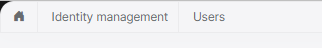
<PageHeader BreadcrumbItems="@BreadcrumbItems" />
The theme then renders the breadcrumb. An example render result can be:
- The Home icon is rendered by default. Set
BreadcrumbShowHometofalseto hide it. - Breadcrumb items will be activated based on current navigation. Set
BreadcrumbShowCurrenttofalseto disable it.
You can add as many items as you need.
{{if BlazorUI == "Blazorise"}}
The Volo.Abp.BlazoriseUI.BreadcrumbItem constructor gets three parameters:
text: The text to show for the breadcrumb item.url(optional): A URL to navigate to, if the user clicks to the breadcrumb item.icon(optional): An icon class (likefas fa-user-tiefor Font-Awesome) to show with thetext.
{{end}}
{{if BlazorUI == "MudBlazor"}}
The MudBlazor.BreadcrumbItem constructor takes:
text: The text to show for the breadcrumb item.href: A URL to navigate to (usenullfor the current page).disabled(optional): Whentrue, the item is rendered as the current/non-clickable item.icon(optional): A Material icon (e.g.Icons.Material.Filled.Language).
{{end}}
Page Toolbar
Page toolbar can be set using the Toolbar property.
Example: Add a "New Item" toolbar item to the page toolbar.
Create a PageToolbar object and define toolbar items using the AddButton extension method.
{{if BlazorUI == "Blazorise"}}
public partial class Index
{
    protected PageToolbar Toolbar { get; } = new();

    protected override void OnInitialized()
    {
        Toolbar.AddButton("New Item", () =>
        {
            //Write your click action here
            return Task.CompletedTask;
        }, icon:IconName.Add);
    }
}
{{end}}
{{if BlazorUI == "MudBlazor"}}
public partial class Index
{
    protected PageToolbar Toolbar { get; } = new();

    protected override void OnInitialized()
    {
        Toolbar.AddButton("New Item", () =>
        {
            //Write your click action here
            return Task.CompletedTask;
        }, icon: MudBlazor.Icons.Material.Filled.Add);
    }
}
{{end}}
Navigate back to the razor page and set the Toolbar parameter.
<PageHeader Toolbar="@Toolbar" />
An example render result can be:

Options
Rendering can be enabled or disabled for each section of PageHeader via using PageHeaderOptions.
    Configure<PageHeaderOptions>(options =>
    {
        options.RenderPageTitle = false;
        options.RenderBreadcrumbs = false;
        options.RenderToolbar = false;
    });
All values are true by default. If the PageHeaderOptions isn't configured, each section will be rendered.