5.7 KiB
| title |
|---|
| Block Manager |
Block Manager
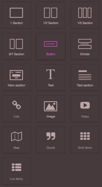
A Block is a simple object which allows the end-user to reuse your Components. It can be connected to a single Component or to a complex composition of them. In this guide, you will see how to setup and take full advantage of the built-in Block Manager UI in GrapesJS. The default UI is a lightweight component with built-in Drag & Drop support, but as you'll see next in this guide, it's easy to extend and create your own UI manager.
::: warning To get a better understanding of the content in this guide, we recommend reading Components first :::
Configuration
To change the default configurations you have to pass the blockManager property with the main configuration object.
const editor = grapesjs.init({
  ...
  blockManager: {
    blocks: [...],
    ...
  }
});
Check the full list of available options here: Block Manager Config
Initialization
By default, Block Manager UI is considered a hidden component. Currently, the GrapesJS core, renders default panels and buttons that allow you to show them, but in long term, this is something that might will change. Here below you can see how to init the editor without default panels and immediately rendered Block Manager UI.
const editor = grapesjs.init({
  container: '#gjs',
  height: '100%',
  storageManager: false,
  panels: { defaults: [] }, // Avoid default panels
  blockManager: {
    blocks: [
      {
        label: 'Image', // Label of the block
        content: { type: 'image' } // `image` component
      }
    ],
  }
});
The difference between components and blocks: The component is more atomic, so a single image, a text box or a map is a component. The block is what the end user will drag inside the canvas, so it could contain a single image (single Component) or the entire section like, for example, the footer with a lot of components inside (texts, images, inputs, etc).
Check out the Components page to see the list of built-in components and how to create your own.
Let's see how to add a new block to the editor using the Blocks API
var editor = grapesjs.init({...});
var blockManager = editor.BlockManager;

// 'my-first-block' is the ID of the block
blockManager.add('my-first-block', {
  label: 'Simple block',
  content: '<div class="my-block">This is a simple block</div>',
});
With this snippet a new block will be added to the collection. You can also update existent blocks
blockManager.get('my-first-block').set({
  label: 'Updated simple block',
  attributes: {
    title: 'My title'
  }
})
As you see a simple HTML string is enough to create a block, the editor will do the rest. If you want you could also pass an object representing the Component.
blockManager.add('my-map-block', {
  label: 'Simple map block',
  content: {
    type: 'map', // Built-in 'map' component
    style: {
      height: '350px'
    },
    removable: false, // Once inserted it can't be removed
  }
})
From v0.3.70 it's also possible to pass the HTML string with Component's properties as attributes.
blockManager.add('the-row-block', {
  label: '2 Columns',
  content: '<div class="row" data-gjs-droppable=".row-cell" data-gjs-custom-name="Row">' +
      '<div class="row-cell" data-gjs-draggable=".row"></div>' +
      '<div class="row-cell" data-gjs-draggable=".row"></div>' +
    '</div>',
});
In the example above you're defining a row component which will accept only elements which match '.row-cell' selector and cells which could be dragged only inside '.row' elements. We're also defining the custom name which will be seen inside the Layers panel. If you want to check the complete list of available Component's properties, check directly the Component model source: https://github.com/artf/grapesjs/blob/dev/src/dom_components/model/Component.js
Custom render
If you need to customize the aspect of each block you can pass a render callback function in the block definition. Let's see how it works.
As a first option, you can return a simple HTML string, which will be used as a new inner content of the block. As an argument of the callback you will get an object containing the following properties:
model- Block's model (so you can use any passed property to it)el- Current rendered HTMLElement of the blockclassName- The base class name used for blocks (useful if you follow BEM, so you can create classes like${className}__elem)
blockManager.add('some-block-id', {
  label: `<div>
      <img src="https://picsum.photos/70/70"/>
      <div class="my-label-block">Label block</div>
    </div>`,
  content: '<div>...</div>',
  render: ({ model, className }) => `<div class="${className}__my-wrap">
      Before label
      ${model.get('label')}
      After label
    </div>`,
});
Another option would be to avoid returning from the callback (in that case nothing will be replaced) and edit only the current el block element
blockManager.add('some-block-id', {
  // ...
  render: ({ el }) => {
    const btn = document.createElement('button');
    btn.innerHTML = 'Click me';
    btn.addEventListener('click', () => alert('Do something'))
    el.appendChild(btn);
  },
});